Warby Parker
Role
UX Designer
Responsibilities
Design IC (User Experience), User Research & Usability Testing
Team
X-functional team of nine
Design team of four

The Home Try-On program was primetime for iteration.
Friction-free frame finding
In my time at Warby Parker, the company transitioned from an online-only business to one innovating across digital and retail.
This strategic shift enabled our product team to focus on a gamut of cross-platform experience design, all with the ultimate goal of making glasses-finding a fun, lighthearted, and — dare-we-say —enjoyable.

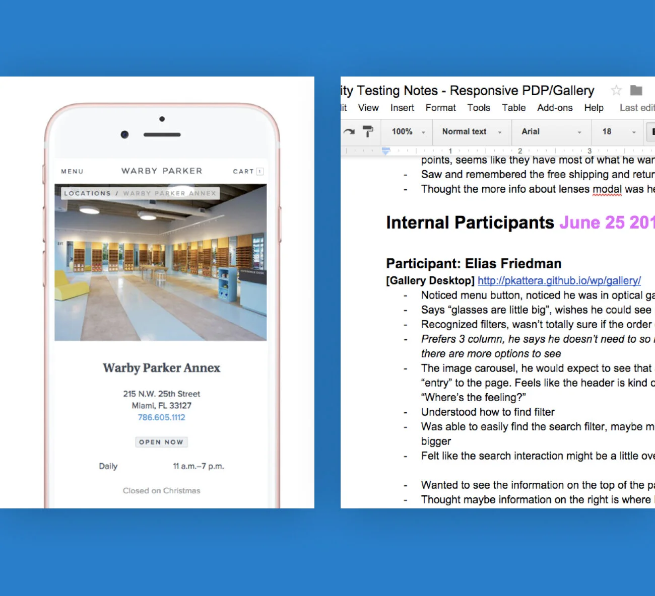
Warby’s first fluid canvas in action, achieving parity across devices.
Goodbye m dot, hello responsive
In order to optimize the shopping experience and ensure parity across devices, one of my first major tasks was to sunset the company’s outdated mobile website and replace it with a fully responsive eCommerce platform.
This required an extensive content audit, rearchitected and refreshed taxonomy, and entirely new system of design patterns.

The IA was restructured for findability.
Each section of the website was improved based on usability and goals uncovered in user interviews.
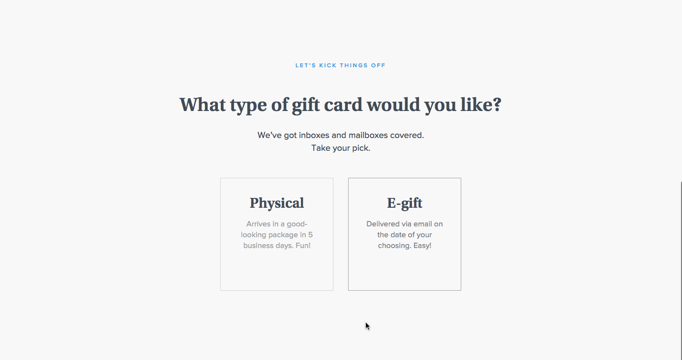
Transitions in the gift card experience, which was a pivotal revenue driver in the holiday season.
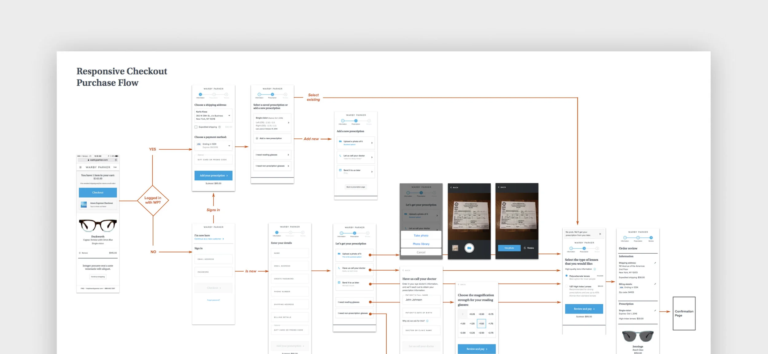
The checkout flow for prescription lenses is more complex than you might guess, particularly since a ton of customers have outdated Rxs.
Conversion-lifting checkout
In redesigning checkout, we transitioned from a single-page experience to a multi-step flow with less cognitive load. Additionally, we were able to reduce the number of form fields and provide alternate, lower-friction ways to share a prescription (uploading post-purchase, or having us call your doctor for you).
These changes helped lift the conversion rate and hit online revenue targets for the business.
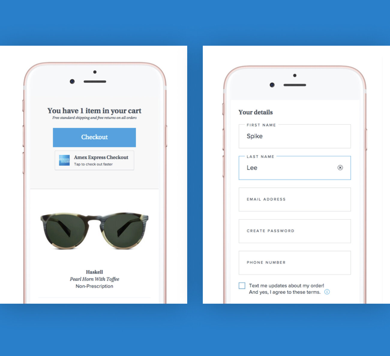
The cart was visually refined and incorporated new express checkout methods.

We also experimented with abandon cart reminders, motivating shoppers to pick up where they left off on repeat visits.
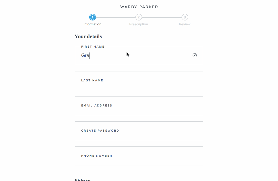
Implementing float labels and focus states helped users stay oriented as they filled out their information.
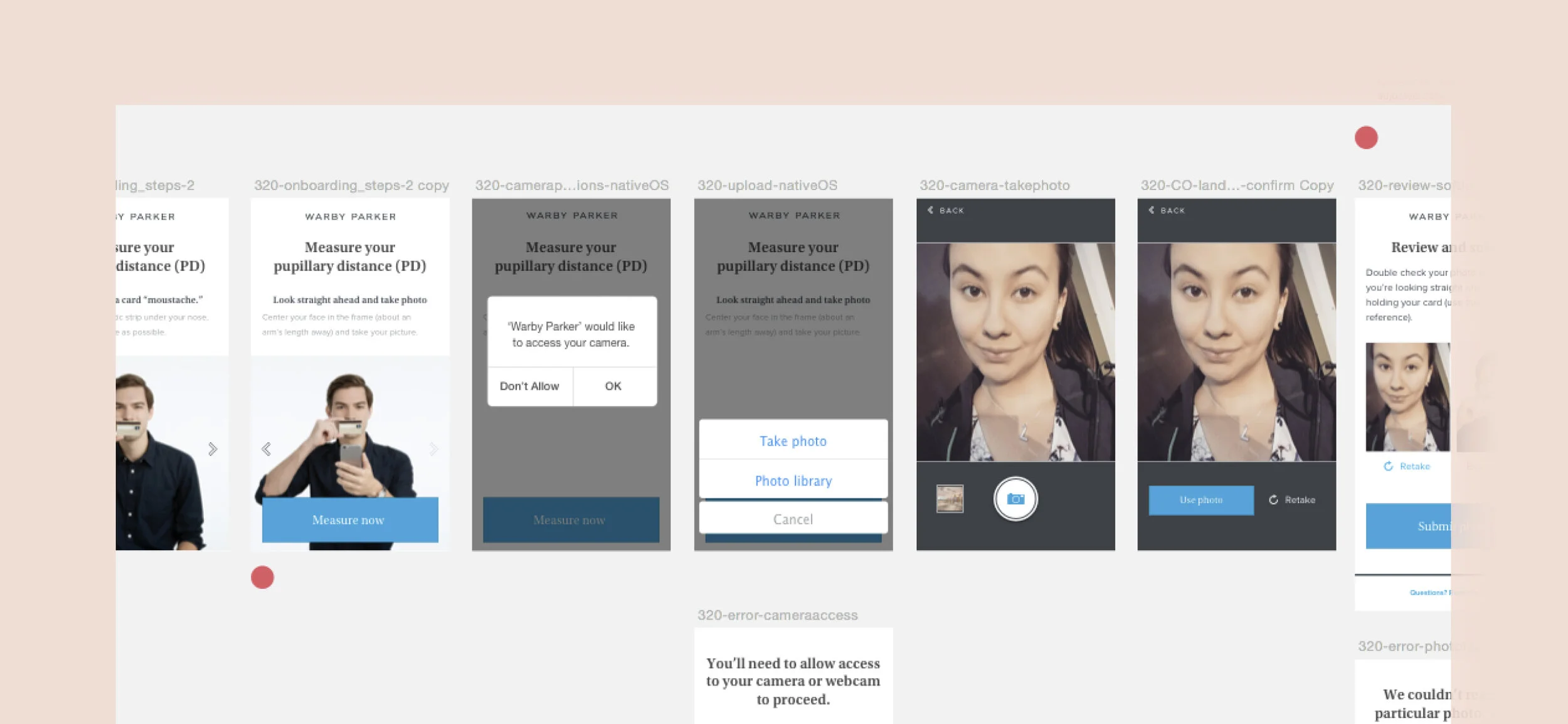
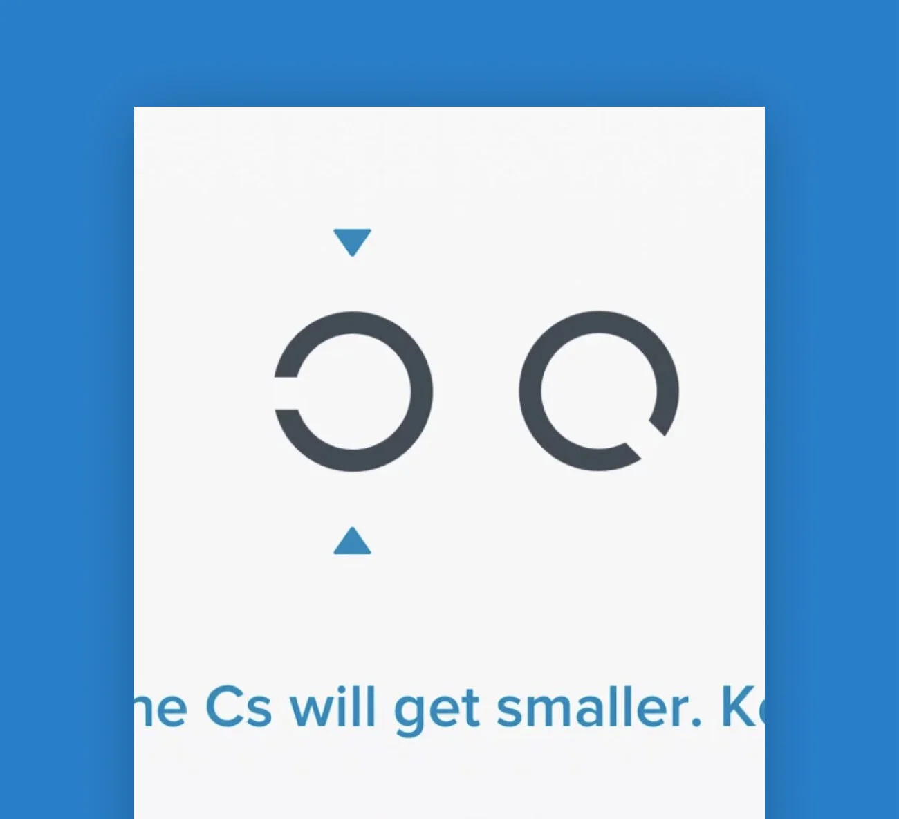
PDs are complicated, but adding examples of “correct” photos to the onboarding process helped reduce the fail rate of ones customers submitted to us.
PDs, RXs, and a splash of R&D
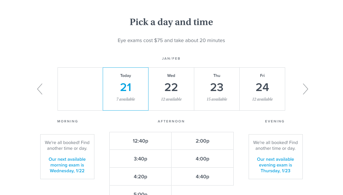
Optical care comes with its fair share of confusing measurements, with pupillary distance (PD) and prescriptions (single-vision and progressive) being at the top of the “I don’t get it” list.
To de-mystify these numbers for consumers, I re-did our PD measurement and eye exam booking flow start to finish, optimizing for confidence and completion rate.
I was also the first designer to prototype out early designs for the company’s now-released Prescription Check app, enabling customers to renew their prescription at home.